Showing posts with label Colouring - Alcohol Markers. Show all posts

Monday, 21 May 2018

3 Bottles

I decided to try to be organised for my holidays this year by buying some 100ml cosmetic bottles for my holibobs (Wilkos had them for 50p each or 3 for 2).  They even have detachable clips to prevent them from dispensing whilst squished in transit.  

I decided to decorate the labels with semi-related images;  I chose 
  1. James with his umbrella for shower gel, 
  2. Umbrella bear with a wet head for shampoo, and 
  3. Dressed Up girlie bear touching her face for cleanser
Well, they kind of work!  :0)

All of the digis are from Lili of the Valley and I printed them onto normal white printer labels.  I will admit that the labels were awful to colour but the images were so small I decided it didn't really matter. My blending and shading sort of went out the window but they'll be no prizes for colouring on this project!

I covered the labels with clear tape to protect them from condensation and moisture when they're in the bathroom, but I took the photographs before I added the tape because I knew it would be difficult to photograph if they were glossy.

In case you're desperate to know, the font I used for the text is called "KG Beneath Your Beautiful Chunk".  It bothers me that I want to change the "your" in its name to "you're" because as it currently reads I am left to ponder what a 'KG' is, why one might be stored beneath a 'chunk' and what a 'chunk' actually is (beautiful or otherwise).  

Surely these are too many questions for a mere font name to generate?

I'm off to lie down in a dark room.


Recipe:
I've been inspired by:
Happy crafting
Annette
xx


Sunday, 22 October 2017

Little Miss ...

The 12 new 'Thoroughly Modern Misses' images from Lili of the Valley are due to be released tomorrow and I've been playing with some of them as well as the corresponding calendar months for 2018.  

I've bound them together using my Zutter and some white binding wires with some mount-board covers covered with some pretty pastel pink paper.

I coloured these ladies with Copics for a change but I admit that I struggled as fair bit because I've not used my markers for months, maybe even over a year and have clearly got out of practice.  Hopefully Faye isn't looking!


Project Recipe:
Happy crafting
Annette
xx


Wednesday, 7 December 2016

Penguin Chicks Skating

I've used the same images that I used to create Monday's tag set but this time on cards and added a sentiment to create a simple flat card matted onto Kraft card.  They're really CAS and I think they could be ok for a guy's card.  The sentiment is a digi which I printed onto white card before stamping the image and die cutting using a square that I ran through my die cutter half way before extracting and re-positioning and running through again to make a die cut rectangle rather than a square!


Card Recipe:
I've been inspired by:
Happy crafting
Annette
xx


Sunday, 4 December 2016

Christmas Wishes - Take 2

Following yesterday's post, I'm sharing the second set of my uber CAS cards today. They were quite quick to make and although they're still cute, I think they'll be ok to give to the guys!


Card Recipe:
I've been inspired by:
Happy crafting
Annette
xx


Saturday, 3 December 2016

Christmas Wishes - Take 1

I'm posting a little set of cards that I made, they are a little smaller than my usual 6x6 squares as they're A5 sized, and they're uber clean and simple in layout, but still cute!  I thought they would be useful to have a little stock of unfussy cards for the guys!  I hope you like them.


Card Recipe:
I've been inspired by:
Happy crafting
Annette
xx


Thursday, 27 October 2016

Polka Doodling

As it's getting colder now, we all need to layer up to keep warm, and this week at In The Pink we're looking for layers in our creations too!

I've used a sweet little girlie image from Polkadoodles and created layers with lace, velvet ribbon, patterned papers and my image panel, as well as some more lace and die cuts on that too. :0)


Card Recipe:

Created for:


Sponsored by:


I've been inspired by:
Happy crafting
Annette
xx


Sunday, 16 October 2016

Around the World

It's a Just for Fun make from me today using a Tilda which I've not used for a while.  I wanted to use this image to create a travel journal and kept the emblies to a minimum to minimise bulk.  I covered some thick cardboard with designer papers, folding and sticking them onto the reverse before lining the inside with plain paper to match the papers of the journal.  I used a border die to create some additional interest along the bound edge before using my binding machine to hold it all together.


Card Recipe:
I've been inspired by:
Happy crafting
Annette
xx


Sunday, 25 September 2016

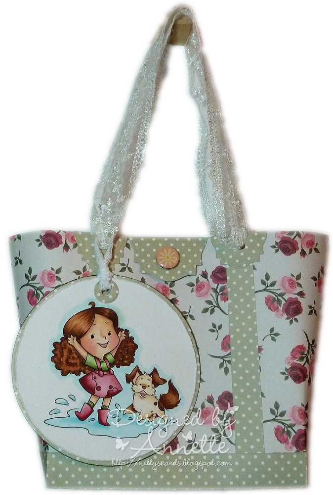
Splashing Around Baggie

There's another new release at Crafty Sentiment Designs, and my project today features one of them, called 'Splashing Around'.  I've made a little baggie Simoand decorated it with a tag using the image. The handles are lace and there's a little closure which I've made using a mini magnet.


Project Recipe:
I've been inspired by:
  • Simon's Wednesday Challenge - Gift
Happy crafting
Annette
xx


Monday, 19 September 2016

Splashing Around

This is the same image that I used on my clock a couple of days ago, but this time she's on a CAS card.   In contrast to yesterday's CAS layout, I've used a stitched speech die and 'hello' script die for the panel at the top.


Card Recipe:
I've been inspired by:
  • Simon's Wednesday Challenge - CAS
  • Copic Marker Europe - Skin
Happy crafting
Annette
xx


Friday, 16 September 2016

Splashing Clock

It's been a while since I shared one of my clocks and today's creation features a cute digi from Crafty Sentiment Designs.  I used my trusty clock template (see my freebies page if you want to grab it) and mountboard for the base.  I think this is the last of my clock mechanisms too so it may be my last clock for a while :0(


Card Recipe:
I've been inspired by:
Happy crafting
Annette
xx


Tuesday, 23 August 2016

Dropping the Shopping (and a review)

I've been inspired by Aileen to write a review on the Docrafts Artiste pens that I bought last month, which gave me an ideal opportunity to have another play with them at the weekend.

In order to really decide how I feel about using them, I decided to colour the same image in four different mediums; Copics, Derwent Inktense Pencils, DI Reinkers and the Artiste Markers.

I'm certainly not an expert in any of these products, nor am I connected to any of the companies in any way (a girl can dream though, right!).  Although I am more confident with those that I use most often, I'll try not to let my comfort with my most frequently used mediums bias my comments.

The image I've used is called Dropping the Shopping by Lili of the Valley.  I chose this mainly because it included skin, hair and clothing as well as something cute and furry!  I thought all of these elements would give me a better range of colouring challenges upon which to make my comparison.

So here goes .....

Copic Alcohol Markers 

I thought I'd set the benchmark with the medium I find quickest to colour with in order to determine where I wanted the shadow & light and also to choose my colours. So my first sample is using Copics.  These are the only medium which are alcohol-based, rather than water-based, so I stamped with Momento ink onto smooth white card.

I've actually not used Copics for a few weeks, so it wasn't as easy as I'd thought!  To intensify the comparison challenge I decided to include some 'white' areas, and also outline the whole image with blue to give it a bit of 'pop'.

As usual, the pens were easy to blend (although I do find red the hardest to blend well) and I tried a couple of different techniques, including 'dotting' the grey to shade the hat and cuffs.

So, the bar is set, and although I think I could have tried harder with the pleats in her coat, I was fairly pleased with the end result.

So here's the Copic entry:


Docrafts Artiste Watercolour Markers

While I was in 'marker mode' I thought I'd dive straight into the Artiste marker pens.  These are watercolour pens, so I stamped with Stazon onto my preferred Langton watercolour 300gsm card. 

The first noticeable difference to Copics was the range of colours.  I have the 36 colour set so had to decide which colours were going to give me the best comparison to the Copics (erm, yes, I may possibly have slightly more than 36 Copics in my collection!).  For example, when I use Copics to colour skin, I use up to 7 different pens, but with the Artistes, I only had 3; a skin colour, a tan brown for the shadow, and a pink blush for her cheeks.  It probably helped that there was a relatively small surface area of skin on this image, but I think that the shading turned out ok, and she even has a little bridge on her nose where I popped in a bit of extra shadow, just as I'd done with the Copics.

The second main difference between the Artistes and the Copics was the brightness of the colours. I could possibly have used brighter colours in the Copics, but almost all 36 of the Artiste colours are bright, and there are no 'dusky' shades.  This makes the image instantly appear brighter.

When using the pens, I found that I didn't need to add very much ink before 'dragging' it out with my waterbrush. It was easy to add layers (using the same colour on top of the last layer to add depth and shading). I only used the brush nibs, but they are exceptionally fine and therefore accurate, and can get into the smallest corner to add colour.  It was also easy to add a bit of shading to the gathers at the base of her coat. 

There were relatively few colours suitable for the furries, but I used two separate shades of brown on the pup and he turned out a mahogany colour.  The 'white-grey' was fairly easy to shade, and the ink watered down really well to give just a hint of colour where I wanted only a subtle softness. Even the blue halo around the image was easy, although the blue was a fairly dark hue, so I ended up swiping the water brush down the pen's brush nib and adding the ink off the water brush instead of directly from the marker to make it lighter.  I guess I could have scribbled some marker ink onto an acrylic block and picked that up with my brush, but I was being lazy!

Overall, the pens were as easy to apply as Copics, but blended via water.  I feel that water-colouring looks softer and I found it easier to blend away harsh lines without washing out the colour which I sometimes suffer from with Copics when blending a lighter shade after a darker shade.


Derwent Inktense Pencils

The pencils are the medium that I'm least comfortable with.  I love how other people use them with great effect and I love the softness of shades that I've seen achieved.  I invested in a fabulous set of Inktense Pencils a while ago and they've seen very little use because I simply don't feel confident using them. However, I've bitten the bullet and included them in my colouring comparison.

The range of colours is huge (I have the beautiful wooden boxset of 72 pencils), and I love that they blend with water rather than the paper-stumps and Sansodor, but I do find that I can't always blend out the original area that the pencil makes on the paper and it leaves a feint line that is still visible after a lot of furious blending.

In order to do the 'halo effect' around the image I used my watercolour brush to take colour from the pencil and then transfer it from the brush onto the paper rather than applying the pencil directly to the image. This seemed to reduce the problem of the un-blended lines. The colours were a bit dusky and gave the image more of a vintage look.

One of the main problems I found was that even if the paper was only fractionally damp, the pencil lines were worse and if the pencil itself got wet, then I had to say goodbye to any hope of blending. However, I did find then that I could use the brush-to-pencil application method really easily to great effect.  

As well as loving the effect that I'd seen others' produce with them, another reason that I actually bought the pencils originally was their portability.  I couldn't take my reinker pallets with me when I left the house because the inks are far too runny, so I was limited to Copics if I wanted to colour anywhere than at home.  Saying that, hubby wasn't too impressed when I sneaked the rather bulky wooden box into his suitcase (I was travelling light with all my clothes in just hand-luggage) when we went on holibobs earlier this year.  Men just don't understand a crafter's obsessions!  I could've taken them out of their box to make them less bulky, but the box actually doubled up as an image protector and kept my images flat and safe from dog-ears in transit too. :0)


Distress Ink Reinkers

So lastly I've used the medium that I'm most comfortable with, my Ranger Distress Ink Reinkers.  I have 55 of the dinky bottles of inks, (eek, I've never counted them before) stored in 2 of the Tim Holtz palette trays.  On the downside, they have practically zero portability (I just about manage to take them outside onto the garden table, but even then once fell foul of a gust of wind that took hold of the tray and gave me a multicoloured gravel path and an empty palette.  If you prefer you can, I believe, use the ink pads instead and grab ink with your paintbrush by pressing ink from the pad onto an acrylic block (or the lid).  However, the reinkers are more cost effective (and I don't want 55 ink pads) and their lack of portability is more than compensated by the range of depth and shadow that can be achieved.  You can get an amazing array of style using these inks, from beautiful, soft, romantic, subtle hues (see the lovely Squirrel's amazingly delicate colouring) to the higher contrast effect that is all I seem to be able to achieve (despite my occasional attempts to take a leaf out of Squirrel's book and "keep it soft").

Another consideration is that these bottles of inks last ages because you need so little ink on the paintbrush. I've been using them for years, often on a daily basis, and I've not even used a quarter of a bottle of any of my colours yet, even those I use most like the browns.  A single drop from the pipette lasts months and they don't evaporate on the palette either.

Like the pencils, you have to be uber careful if you find you're adding another layer on top if the previous layer isn't quite dry because it will bleed. Worse, and far far far worse than any of the other mediums I've mentioned above, if you don't allow one colour to dry before colouring a neighbouring area you are at a high risk of colours bleeding into each other.  This can sometimes be saved with a clean damp brush and blotting with kitchen paper but is heartbreaking when it happens, especially if you've coloured most of the image.  I did have a small mishap (*ahem* purely in the name of research for this review, of course) on the bottom left corner of the purple bag, but I blended it with water to wash it down, and then the blue halo faded it a bit more, but that happened because I added the blue halo before the purple was dry, which can take some time.

Overall, despite their challenging mishaps, and lack of portability, the inks are still my go-to colouring options, but that doesn't mean I'm going to be getting rid of my Copics, Inktense pencils or Artiste watercolour markers anytime soon!


Side by Side

As a final comparison here are all 4 finished images side by side.  The Copics are on smooth white card, and the others, all being watercolour mediums, are on Langton which is a bit creamier in colour. My lamp was also in the top left corner of my desk!
  1. Top left : Copics
  2. Top right : Docraft Artiste Watercolour Markers
  3. Bottom left : Derwent Inktense Pencils
  4. Bottom right : Ranger Distress Ink Reinkers


And finally:

Here's a finished card using one of the images.  But can you see which one?  No prizes for guessing, so it's just for fun, but let me know in the comments section which medium you think I've used on this card! :0)

More importantly, I'd love to hear what you think of the review, and if you have any other questions on any of the above mediums. If you've made it this far down the article, I hope this has been helpful, especially if you're new to any of these colouring tools.


Card Recipe:
My card's been inspired by:
Happy crafting
Annette
xx


Thursday, 14 July 2016

Pingu Pals

Today's the start of a new challenge at As You Like It Challenge and the theme is to show us your 'trademark style'.  I'm not really sure what mine is anymore actually.  It used to be fussy and fancy, with lots of fluff, but I'm also loving the CAS look.  I guess the things that I think I do a lot, and therefore might suggest I'd be recognised in a line up are:
  • Cute critters
  • Chalked sky
  • My "go-to" CAS layout

I've also managed to sneak in some penguins, glitter and ribbon, as well as purple which is one of my 3 favourite colours.


Card Recipe:
I've been inspired by:
  • Simon's Monday Challenge - Flora and Fauna
  • Crafty Calendar - Dies &/or Punches
  • Simon's Wed Challenge - Create a Scene (I used 2 digis to create a Waddle of penguins (that's my favourite name for a group of penguins) & added a chalked cloudy sky)
Happy crafting
Annette
xx


Thursday, 23 June 2016

Beach Babe

I'm in summer mode today with a lovely image from Stamping Bella called Sandy has a Sombrero. I just wish it was me on the beach!  I've added some lace to support the Lace challenge at In The Pink too!  Gotta dash as I'm off to meet some friends today in "Tweeksbury"! :0)


Card Recipe:

Created for:


Sponsored by:


I've been inspired by:
Happy crafting
Annette
xx


Sunday, 19 June 2016

Super Critters

This is my very first attempt at a pop-up box card, and I'm hooked.

This one did take me an age to construct but I really loved the end result.  I used my new Clearly Besotted Caped Cuties and matching dies (a lovely surprise gift from a very dear friend) and lots of dies (grass, fence, landscape borders, stars, stitched circles etc) and created a bespoke sentiment printed onto my backing paper.

I hope you like it because I'm already thinking about my second one!


Here's a bit of a close up. The flying bunny is on a little strip of acetate.


You can tell I loved how this one turned out by the multitude of pictures ... here's one from the front:


Card Recipe:
I've been inspired by:
Happy crafting
Annette
xx


Thursday, 2 June 2016

My name is Annette, and I'm a Chocoholic ...

This weeks' challenge at As You Like It Challenge is to show us what is your favourite food or drink. My favourite could be either, because you can both eat and drink chocolate!  In my project I've used the edible variety in the form of a chocolate cake. Yum!


Card Recipe:
I've been inspired by:
  • Sweet Stamping - Embossing (I embossed around the edge of the oval with a tool)
  • ABC Challenge - Important (it's for by friend's birthday on Sunday)
Happy crafting
Annette
xx


Wednesday, 25 May 2016

Beary Special Wishes

I'm a tad late posting this today, but better late than never, huh?  I'm sharing an image that is new for me from Whipper Snapper called Beary Special and I love his cute face and little ears.  I've also used a new Die-Namics Sunny Skies die and mixed it in with some stitched clouds.  Both the image and the sun die are available from My Mum's Craft Shop.  I've added some chalked clouds to my image using a home-made 'cloud' mask which you can download for free here if you like it.


Card Recipe:
I've been inspired by:
Happy crafting
Annette
xx


Friday, 15 April 2016

Bunny Cuddles

I've splashed out on a fair few Bellas lately and this is my first inking of Becky.  I've followed a sketch, but added on some embellishment in the form of flowers, ribbon and some pearls (my three favourites).  The frills on her skirt were a bit daunting, but not enough to deter me. Cute huh!

The burgundy ribbon and flowers have come out quite a bit darker on the photo than it is in real life which is a shame. :0(


Card Recipe:
I've been inspired by:
Happy crafting
Annette
xx


Friday, 25 March 2016

Easter Wryn

Today I'm sharing my penultimate Easter card ("thank goodness", I hear you say!) but there's not a bunny in sight this time, just Wryn with a baby chick!


Card Recipe:
I've been inspired by:
Happy crafting
Annette
xx


Thursday, 24 March 2016

Happy Easter Bunny & Chick Wobble

It's Thursday and I have a day off work today, so I'm hoping it stays sunny for the long bank-holiday weekend.  Today's project is to support the challenge at As You Like It Challenge where it's a Bingo theme.  I love quite a few of the lines, but my favourite embellishments are usually ribbon & pearls and I do love a spot of purple, so I've opted for the diagonal line.


Card Recipe:
I've been inspired by:
Happy crafting
Annette
xx


Wednesday, 23 March 2016

Boing Boing

So, it's day 3 of my Easter bunny cards, and yup, you've guessed it, it's another Lili of the Valley image!  I told you I'd been busy with the Easter makes!


Card Recipe:
I've been inspired by:
Happy crafting
Annette
xx